How to design your business?
Following our article on the six basic rules of merchandising, we promised to do an article on the layout of its point of sale, and here it is! ☻ A good layout means an original, welcoming and warm atmosphere!
An attractive window display to entice the customer to come in
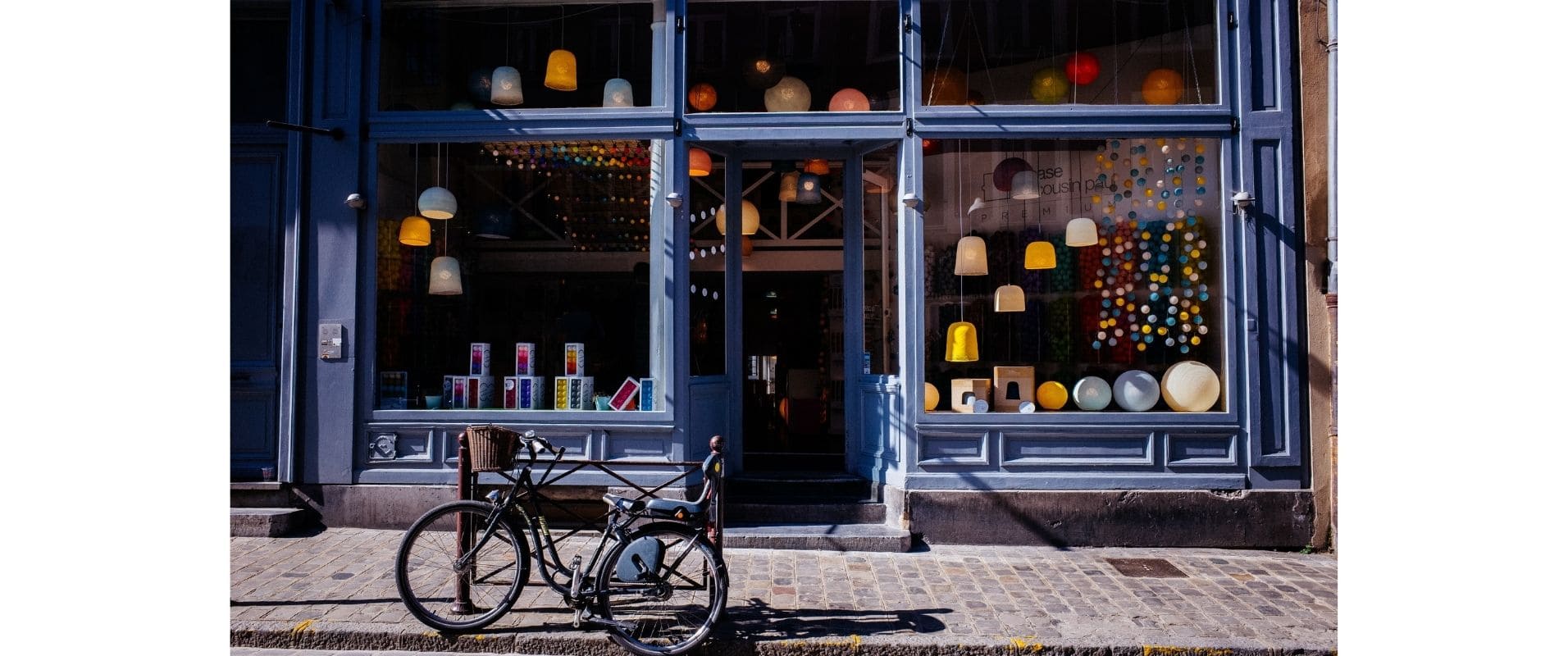
Your shop window is the first point of contact with your customers, hence the importance of its very careful presentation. It must be attractive, make future customers want to come in and discover your products, and above all it must highlight the products offered for sale. Under no circumstances should you neglect it, make it harmonious to hold the attention of passers-by and arouse their curiosity (pedestrians, motorists...)!
To help you in the elaboration of your shop window, you can rely on the AIDA method: attract the customer's Attention, arouse the Interest, trigger the Desire to buy, and thus lead the prospect to the Act of purchase.
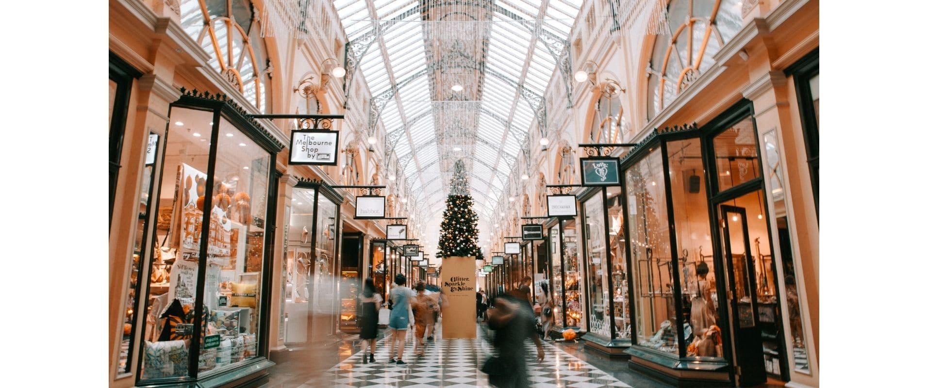
The frequency of renewal must be sustained, about every two weeks. You can also play with the seasonality of the products: in winter you can put a white vinyl on the ground to remind the snow. In summer, you can play with summer furniture (deck chairs, inflatable buoys...). For Valentine's Day, attract passers-by with strong colors such as red and fake gifts placed on nesting tables, or install some chocolate eggs and wicker baskets at Easter, and the trick will be done! :)
An attractive customer journey!
The customer path is very important to encourage the act of purchase! An essential point to take into account is the fact that the passage must be free of any obstacle for people with reduced mobility, so that they can move freely.
The customer journey is based on the following four elements: the direction of the store, the lighting and product displays, the furnishings and the location of the checkout counters.
The direction of travel of the store
Your store is composed of two zones: the hot zone and the cold zone. The hot zone is the natural traffic zone where customers will spontaneously go. This is where you should place your high margin products. The cold zone, on the other hand, is a less frequented area.
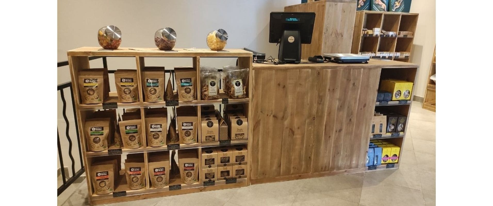
You can put your value products at the back of the store, since these are products that are found in the typical shopping cart, customers will go there without obligation. Don't forget to position products at the checkout to make additional sales.
Lighting and product presentation
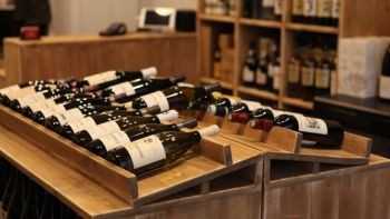
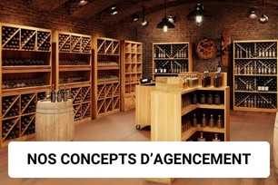
Lighting is used to highlight your products. It should not be too aggressive or too dark. You can choose to accentuate the highlighting of certain products by using spotlights or spotlights on rails that concentrate the light. You can choose to light products on a solid wood display unit for example.
The furnishings
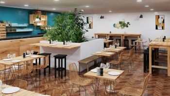
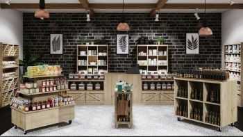
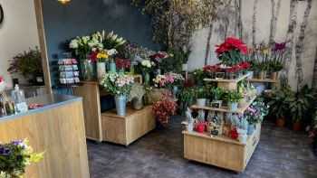
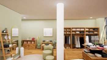
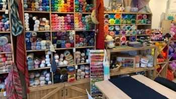
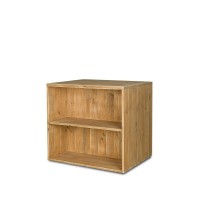
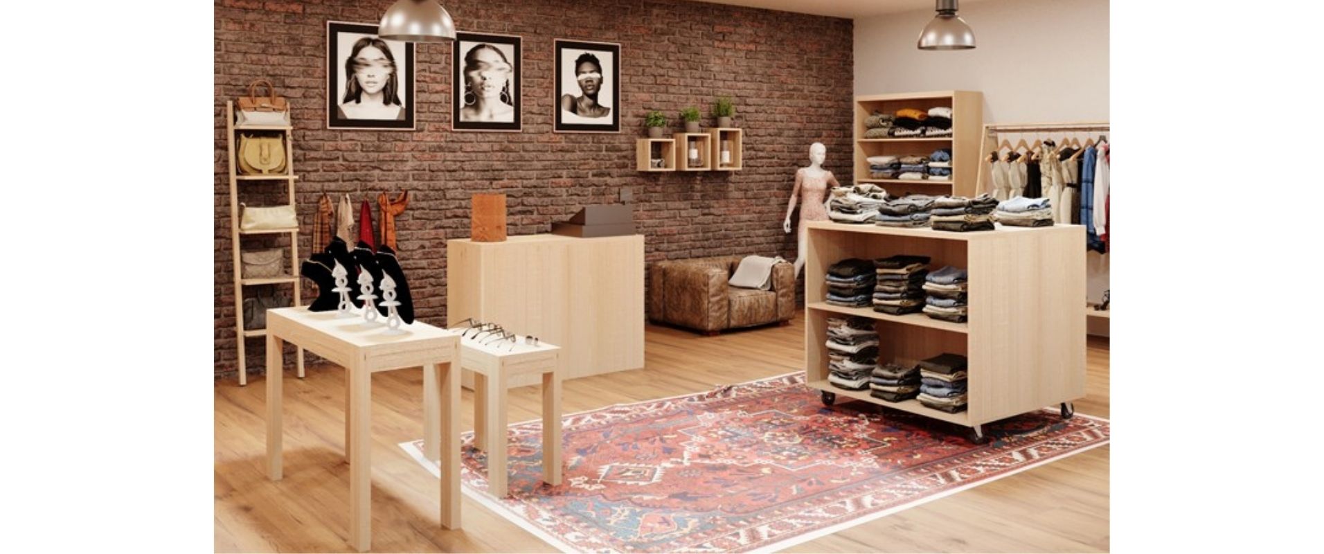
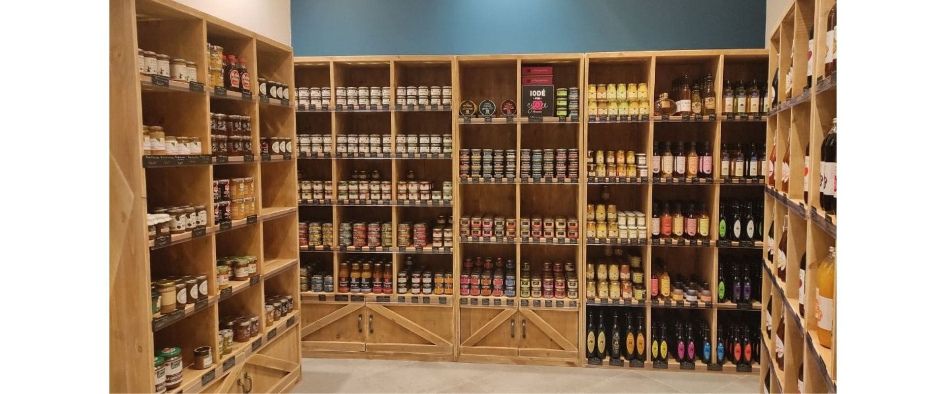
It should reflect your personality and bring out the atmosphere you want to create. Adapt your furniture to your products. Choose furniture such as ladder shelves, tables and consoles, shelves to present your products in a harmonious way. Some display units will be practical to showcase your products. Concerning the finishing of the furniture, it is interesting to choose wooden furniture with the same species, so that your business is harmonious.
The location of the cash registers / counters
In our article on "How to choose the right counter in a store" we give you several tips to choose the right location, such as the strategic place at the entrance or exit of the store to be able to control what is going on, and to be visible.
