Colors and sales: optimize the impact of your physical store
It is possible to increase your sales thanks to the colours present in your business! They have a formidable power to attract consumers, and therefore, boost sales. Let's get together for some advice on choosing colours for your business.
Stay informed about our offers and professional advice
🕐 5 min of reading | Published on: 02/11/2022
How can colours boost your sales?
A study was carried out on the impact of colours on consumers. It found that 92% of respondents felt that colour would play a key role in their purchasing decision.
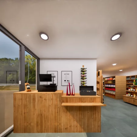
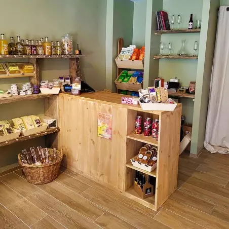
Indeed, it has been proven by several scientific studies that warm colours have a very important impact on consumer behaviour. Especially the colours orange, red and yellow-green, which encourage people to enter a shop. It is worth noting that customers are willing to spend 45% more in a store with a red exterior than in a store with a blue or green exterior, for example. However, keep in mind that the colours you choose for your shop, whether for the front or the sales area, must be consistent with the products you sell and the customers you target.
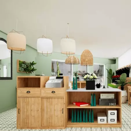
Use cool colours inside your shop
For your sales area, it is not recommended to use warm colours, as they can give a bad impression to your customers. That is why it is necessary to opt for cool shades. This will make your customers feel good, encourage them to take the time to look at your offer and think about it, thus increasing their average shopping basket. However, add a few touches of warm colours near the checkouts. This will encourage impulse buying among your customers. Spikes of red and orange on your accessory displays will make them stand out.
Blue
The color blue means seriousness and precision. It will highlight the professionalism of your business and the quality of your products. However, for restaurateurs, it is not recommended to use this color because it is known to suppress appetite. Nevertheless, it is one of the colors that calms most, and which is often associated with the sky and the sea. It should be noted that the majority of restaurants offering seafood-based menus use this shade. So, be vigilant in using it sparingly.
Green
Green evokes nature, health, and balance. It is often associated with ecology and bio. If you sell natural or eco-friendly products, it is a color to choose for your informative displays or dedicated spaces. Green creates a reassuring and balanced environment, ideal for trade that respects nature.
Brown
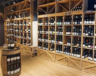
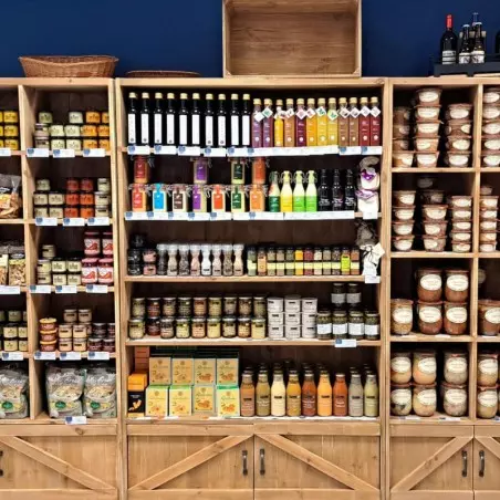
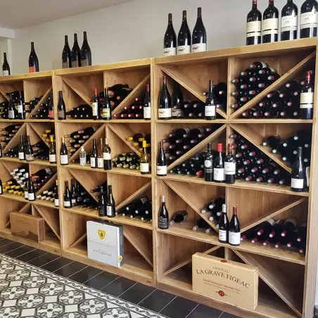
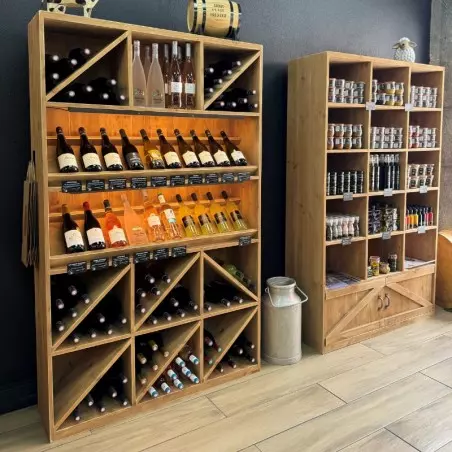
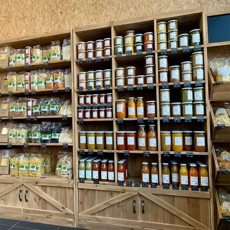
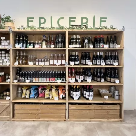
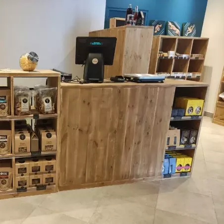
The color of earth and wood, brown symbolizes credibility, solidity, and comfort. It is widely used in delicatessens, wine merchants and craft shops. By evoking the raw material, it creates a warm and authentic atmosphere, perfectly adapted to local products.
Black
Black is synonymous with refinement, elegance and sophistication. Used in moderation, it brings a high-end touch to your shop. However, too much black can darken the space and create a heavy atmosphere. It should therefore be used in small touches on furniture or signage, for example for a chic effect without excess.
Purple
Purple symbolizes creativity, spirituality and luxury. It is an inspiring color, often associated with beauty and well-being. Hair salons, perfumeries or fashion boutiques use it to highlight an elegant and imaginative image. A pastel violet will bring softness, while a deep purple will reinforce the feeling of prestige.
As we explained earlier, using warm colours for your shop front will encourage passers-by to enter your business. There are several reasons for this. Firstly, warm colours attract the eye. You will stand out from the crowd by choosing these colours. In addition, they have a psychological impact on the consumer, encouraging a purchase.
Red
Red evokes energy, passion and urgency. It immediately catches the eye, hence its use in sales signs or special offers. It is a powerful color, to be used to stimulate action, for example on the facade or in promotion areas.
Orange
Orange represents warmth, enthusiasm, and conviviality. Very dynamic, it promotes communication and stimulates the appetite, which makes it perfect for food businesses. Used outdoors, it naturally attracts passersby; indoors, it highlights areas of interest.
Yellow
Yellow symbolizes joy, light, and creativity. It evokes good humor and captures natural light. In a shop, yellow is ideal for highlighting essential areas, such as the counter or the displays. On the other hand, avoid too bright yellow on large surfaces, at the risk of tiring the eyes.
Pink
Pink evokes tenderness, softness, and romance. Highly appreciated in fashion, cosmetics or decoration shops, it creates a welcoming and soothing atmosphere. Used in gradient with white or gold, it brings a modern and refined touch to your space.
Gold
Gold symbolizes wealth, success and quality. In small touches, it values high-end products and draws attention to the featured articles. Combined with black, it reinforces the luxurious aspect of your business. However, excessive use might seem pretentious: dose it with elegance.
Practical advice to harmonize your sales space
To marry the colors well, be sure to create a balance between warm and cold shades. Use bright colors to draw the eye to key areas (countertop, display windows, displays), and more neutral tones to soothe the space.
Also think about the perspective: by placing a bright shade at the bottom of your shop, you naturally invite customers to go there. Finally, adapt your colors to your target: an organic store will favor greens and browns, while a fashion boutique will focus on black, pink, and gold.
💡To remember:
Colors directly influence emotions and purchasing decisions.
Warm shades attract attention and stimulate action: perfect for facades, walkways or promotional spaces.
The cold colors soothe and reassure: ideal for creating a pleasant atmosphere inside the store.
Find the right balance between warm and cool shades to capture attention without tiring the eye.
Adapt your colors to your identity and your target clientele: organic, fashion, gastronomy, well-being... each universe has its ideal palette.
Think about the coherence between facade and interior: a successful first impression encourages customers to enter... and stay!


.webp)


.webp)

_11zon.webp)
_11zon.webp)