How to have a nice shop front?
A shop window is a real communication tool. It must attract and encourage customers to enter your shop. It is the brand image of your shop. It is the first contact. At first glance, your future customers must identify your offer and understand it. Take care of the presentation, ensure clarity, and stage your products to make them want to come in.
The importance of the shop window
Your shop window is the DNA of your shop. It should be designed 3 to 6 months in advance according to the events you have planned. This design stage is very important, as it will reflect the personality of your shop. The potential customer's first stop is your shop window. They should know who you are without even seeing the name of your business and what you sell.
Did you know that we spend about 3 seconds in front of a shop window before continuing on our way, or entering a shop? 3 seconds is not much. That's why seduction and consistency are the key words for an attractive shop window! A shop window is an invitation to enter and discover your entire offer.
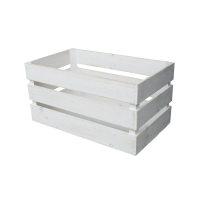
As far as the products you display are concerned, give priority to your flagship products, your bestsellers, and indicate the price. Do not overload the shop front, as this will blur the message you want to get across, and it may also block the visibility inside the shop. You should keep the window simple and uncluttered, as this will not strain customers' eyes. Place the products at eye level and not on the same plane to attract the eye. Use half shelves or overturned crates to create this height.
Pay attention to colours and lighting
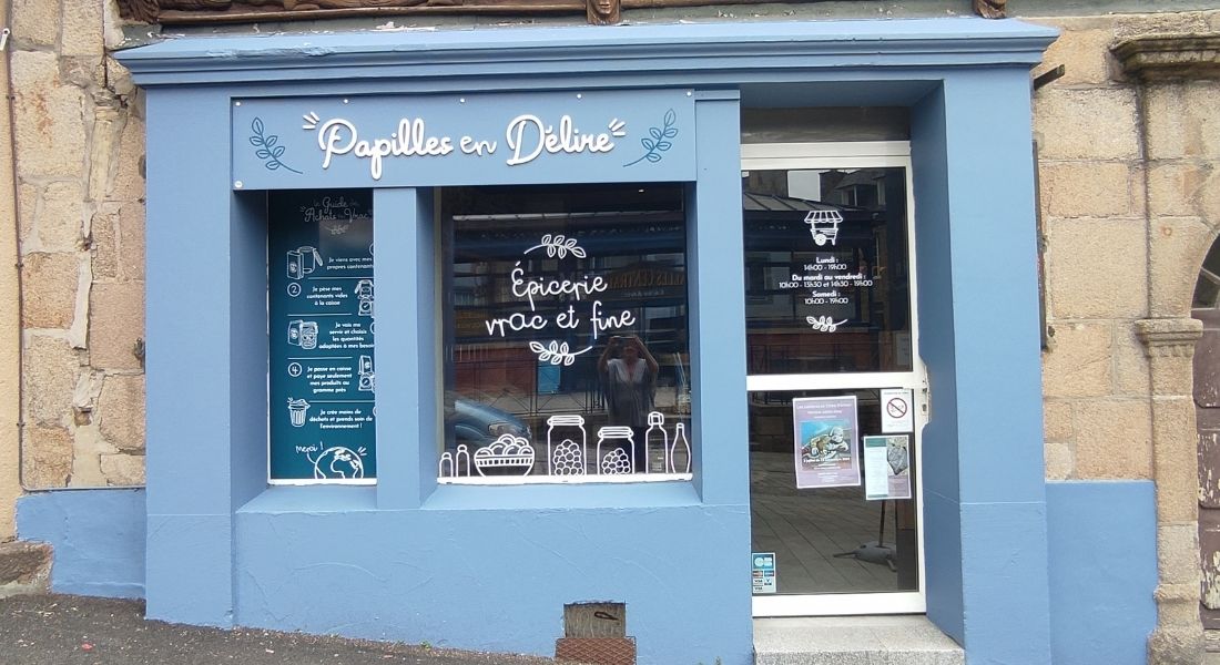
It is important to remember that your shop window is a reflection of your business. It is important to choose a theme to attract your customers and encourage them to enter your business.
Whether it's for the hangers or the back of the window if you have one, it must be colourful, but be careful not to overdo it. The basic rule: do not use more than three colours in the same window. Use colours according to the products you are going to display, as well as the message you want to deliver. For example, red attracts attention, yellow is associated with promotions and sales, green with organic products, and black and white are synonymous with luxury. One colour alone will deliver a message to people looking at your shop window. By playing with colour contrasts, your shop window will be very attractive. Yellow and black are the most powerful contrast, much more so than black and white. Contrasts are created by complementary colours, such as orange and blue, purple and yellow, or red and green. These combinations make them more powerful, because they reinforce each other. Know that next to black, or even dark grey, all colours intensify.
Lighting is an important element. It should not be neglected. Be aware that white lighting from above will overwhelm your décor and your products. If it comes from below, at 45°, the light will elevate your presentation. Be careful, your lighting system must not dazzle the customer. It should be handled with care. You will need bulbs that can withstand being switched on for a long time, but you can switch them off when your shop is closed. LED lighting is the most suitable for this. In addition to having to withstand a long switch-on time, your lighting will have to resist overheating. This is more than essential for energy saving, but more importantly to avoid the risk of fire and short circuits. It is also important to note that the lighting of a shop window is an enhancement light. In this sense, it is preferable to choose cool-coloured luminaires to highlight the articles.
Remember to renew your shop window display regularly
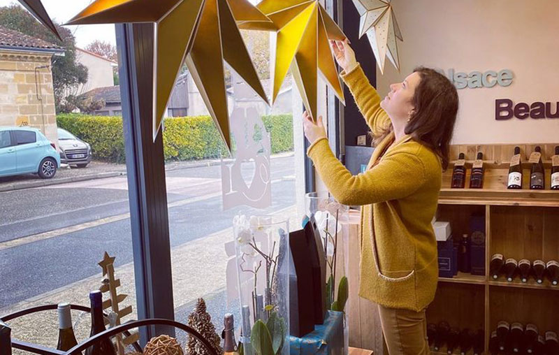
All merchandising professionals will tell you that it is very important to renew your shop window. Once a month would be ideal. Liven up your shop window according to the latest news, the promotions you are offering, or the seasons! Both the products and the decoration of your window should be renewed. And above all, this will prevent passers-by from getting bored. They will be intrigued by the changes, and this will arouse their curiosity.
For optimal organisation, it is in your interest to set up a shop front rotation schedule which will help you decide on the next decorations and products you will put forward at different times of the year. Keep in mind the commercial link between your window display and your sales area. The products in your window should be at the entrance of the shop so that they are easily accessible to your customers. Make sure you have enough stock of your products on display to meet demand, not lose sales and damage your image.

